A very wide range of media technologies were used in the production of the film trailer, poster and magazine cover . Without these media technologies, it would be IMPOSSIBLE to follow out the simplest tasks. The way we decided to use emdia technologies were completely up to us, whether we'd prefer to use final cut pro or iMovie, or even where we'd prefer to upload photos out of slide.com,flikr or prezi.
Monday, 27 December 2010
Wednesday, 8 December 2010
Sunday, 5 December 2010
Ward 13 trailer - extended
This is what we ended coming up with after editing. We already knew at the end of it that it was quite long compared to typical movie trailers lasting 10 seconds! We still thought that this was a good piece of work to show Mr Rosen and Mr Mazzocchi and also to compare with the final Ward 13 trailer.
Mr Rosen gave us some good pointers to improve on when it came to our final edit of our trailer;
-Try not to make it too chronological
-Too many long pauses; faster cuts creates urgency/ anxiety
-Add the necessary things e.g. green screen, credits
-Try making use of a voiceover
-Use another setting footage
We definitely took this points into account when editing our final trailer.
Friday, 3 December 2010
Shot types
Whilst filming, a good use of shots and angles would have definitely gone in handy. So we made sure to use a few good shots, some even used in other horror movie trailers like The Unborn;
 POV shot
 Close-up


Mid close up


Long shot
- It was very good seeing the similarities of these two movies both using a young antagonist and the victim being tortured in different ways. We looked at the shots of The Unborn and worked around using these for comparison of what kind of effect it can make
Wednesday, 1 December 2010
EVALUATION
In what way does my media product use, develop or challenge forms and conventions of real media products?
There were a whole range of media products used to make this trailer, movie poster and magazine cover successful. Just like any other trailer, special effects is a key element and can be used in so many ways to 'wow' the target audience. There is a part of our trailer where there is a sudden rapid change of pace and this really grabs the audience' attention. Whilst showing the Ward 13 trailer to my target audience, they seemed really drawn to the special effects used such as the flatline and voiceovers. After finishing up with the extended version of the trailer, we tried to make the teaser trailer as rapid and shocking as possible so we worked on creating voiceovers rather than just scenes with dialogue. Information in the trailer about the storyline is limited luring the audience into watching, especially at the end of the trailer when we see the Doctor unconscious but Maya alive.
Above is commentary on the Ward 13 trailer with overall judgements and thoughts of each shot.
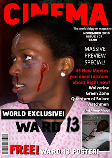
We also created and designed a film poster. Whilst creating it I also looked at existing film posters such as 'Let Me In' which included quite dark and calm colours but yet, a shocking photo was used. We made sure to not use too many colours, only the main 'scary' colours which were red, white and black and the image to really 'wow' the audience. Film posters like 'Saw' always include images of torture that asks the question 'how do they do that?' and also lures them into watch something quite uncomfortable. In the Ward 13 film poster, text and image are both very important; the image making the audience wonder if they are a victim or villain, and the words such as the tagline making the audience realise that there is a certain history behind the storyline.
Lastly, we created a magazine cover. We had good experience of hot to create one as in Year 12 we were required to make a music magazine. We included the main elements needed; a bold title indicating the name of the magazine, the title of the film, a catchy image taken from the movie etc. It didn;t take long to do and came out 'looking like an actual magazine publication' which was said by a lot of our target audience which we were very pleased with.
How effective is the combination of my main media product and ancillary texts?
I believe our forms of marketing have been very effective as it can reach out to audiences globally and draw in a wide variety of audiences. The bits of dialogue in the trailer where the audience may have not listened to and the rapid movement of Maya will really draw the audience in, wondering why the little girl is now evil. This movie trailer can be promoted in a range of places such as on buses, billboards, and perhaps the most valuable source; the internet(also known as synergy).
Through these sources, news will spread around, not only about the trailer but also the movie poster and magazine cover of torturous images. An example of this type of distribution was also used by Noel Clarke, writer and director of Adulthood (2008), included the advertisement of this movie in music videos, created a Myspace page, hundreds of facebook pages were made as well as advertisement on TV.
This variety of distribution is very good as it reaches out to audiences who prefer to receive advertising in different ways.
What have you learned from your audience feedback?
I have learnt that there are A LOT of horror movie trailers released very often for a reason - the ideas of directors are very unique - they always start off with an incredible storyline and produce it through shockingly scary images and concepts - which is what I hope Ward 13 has portrayed. Being different is one thing, but being original is something else. Once you have that unique idea of a story line and how it can be conveyed through images, you will end up with a perfect trailer! At first, mine and Eleona's idea of a film trailer were a bit too typical cliche, and would only attract a niche audience, which isn't what we were hoping for.


A lot of the comments including feelings of being 'shocked' and suprised - as if they didn't see anything coming that drastic which was good. I believe this was a good way of getting audience feedback as Facebook is a good way of communicating with people as it is a very well known social networking site. From the feedback, I can see that we did a great job of attracting the target audience. I also believe that we contained something different; a UNIQUE SELLING POINT which was the 'innocent young girl' becoming the villain. Another positive point made by A LOT of people that had watched the trailer was that they would love to see the movie!
Wednesday, 24 November 2010
Audience feedback of film poster
It was very good to see that from the audience feedback that the Ward 13 film poster was being compared with other movie posters. With the help of formats such as Photoshop, it is very possible to design something making it look real.
Editing
Whilst filming, we made sure to have as much footage as possible, so that there would be a variety to choose from. We then chose the best bits of footage and began editing on iMovie HD;
 iMovie was quite easy to use as it could a range of things such as organising, editing, sounding and cutting parts of each clip. It was also very reliable to use as if you accidentally deleted a clip, you could click on 'undo' and the clip would re-appear.
I used Final Cut Pro to do the special effects, sounds and the 'complicated' things. I was lucky enough to have this software of my personal computer so it was easily accessible and I could have more time to work on it.

Wednesday, 17 November 2010
Movie magazine cover

We chose the name 'Cinema' for the movie magazine which is very suitable for any genre movie, it doesn't necessarily have to be a horror movie magazine because just by looking at the photo, the reader could tell straight away what genre.
We used quite an effective picture taken from the movie for the magazine cover to freak out the reader a bit.
We already had some experience of magazine covers as from year 12 work, we learnt the basic things needed on a front cover;
A big, bold title
A main use of colours e.g. cinema - red,white and black [like NME]
A lot of text/ information luring the reader to buy the magazine!
Film company film poster design
We still stuck with the creative film company name 'Light Scream', btu we thought that the design was a bit bland and needed to be improved so we ended up with this design which was much better
Photoshop was a very helpful device to improve the look of the film company on the movie poster. By looking at this alone, it would definitely look like it belongs on a film poster
Ward 13 film poster


EXAMPLE;

This was the first example of the Ward 13 film poster. We decided to make another different example so that it would show the progression of the appearance of the movie poster, and so that there would be a variety; we could choose from one to the other and plus we had time.

Starting the film poster wasn't bad as I was already aware of how to use Photoshop. After seeing the result of the film poster, me and Eleona realised that the image wasn't powerful enough. We still decided to blog this to show different examples of film posters for Ward 13. To produce the text on the film poster, I also looked at other film posters for inspiration such as 'Let Me In'. All film posters HAVE to include;
-The title; of course
-The production company
-A tagline
-Age certificate
-Any useful information i.e. actors or directors
Saturday, 13 November 2010
Filming
With the help of the action planning sheet we were given in class, we were able to organise WHEN we would be filming, WHO would be needed, WHERE it was and WHAT would be needed.
The first filming we did was the 'Torture room' scene which was the last bit of the trailer but since it was easily accesible to film at, that is why we decided to film there first. Me and Eleona took turns whilst filming and it went well. The main character, Doctor Lemmings was obviously needed for this part.


The second part of filming we did took place in Homerton Hospital; where the film is based on. David (Doctor Lemmings) and Myself were needed for this part and Eleona was the camera person. This part of the trailer is very chilling for the audience as the 'dead patient' appears to haunt Doctor Lemmings.

The third part of filming was the 'office' scene when Doctor Lemmings is informed by co-worker Donna, that his favourite patient Maya has died. This part of the scene contains dialogue and basically tells a bit of the content of what has happened and explains the storyline. Every word in a trailer counts - especially the trailers we see today that can last up to 20 seconds. Me and Eleona both filmed as I playing Maya wasn't needed in this scene.


[To see all filming pictures please click on following link]

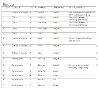
Shot List
This was also very helpful for editing on iMovie as we would know how to organise the footage
Friday, 12 November 2010
Film company


We found it quite enjoyably making up our own film company name since I knew a lot of groups in our class would most probably use the company 'Twisted Pictures', so it was good for us to do something different. We chose the name 'Light Scream' as there is something quite mysterious about the name and it suits the introduction of a horror movie trailer.
Tuesday, 9 November 2010
Evaluation of my Research and Planning


Research and planning contributed A LOT to the production, analysis and note taking of producing my horror movie trailer as it covered almost EVERYTHING needed to be considered whilst undergoing filming and brainstorming. We definitely USED conventions of the horror genre with the use of props we had. Bits of costume such as scabs on the face, blood and a patients suit really convey the hospital theme in ‘Ward 13’ and was really effective, especially for the character Maya who is the antagonist. At first Me and Eleona were just going to put a mask on Maya, making her look more like a monster but blemishes and cuts on her face really completed the ‘look’ we imagined her having, since her character had risen from the dead. This developed the forms and conventions of the horror genre by improving the looks of the character Maya to make it look more professional. We definitely challenged forms and conventions of the Horror Genre. As me and Eleona noticed, in the other groups in our media class, the characters were teenagers whereas in Ward 13, the characters came across as older and mature and since the age certificate for most horror movie trailers in our class were aimed at a 15+ audience, it would obviously appeal to people aged 15 and above. However, after doing some research on film and age certificates, its not always certain age groups that would go to see certain films, most of the time it depends on the characters in the film. Our main target audience were aged 15-28 as it isn’t necessarily a mature film, it is just the characters that are mature and this film would be quite understandable for this age group as the storyline isn’t too complicated.
Friday, 5 November 2010
Age certificates
 We chose to make our film a 15. This would mean that anyone over 15 years old can legally watch, so we have already limited our audience. However, our core audience is 15-28 year olds and the secondary is 28-38 years old. We should be able to reach a large audience, which would help to maximise publicity.
We decided to have the certificate as 'TBC' as it doesn't necessarily target a certain age group - it targets a range of adults
Wednesday, 3 November 2010
Action planning
The organisation of this film trailer really had to be precise and the work had to be efficient. We made sure that we knew the days of filming, what we would be doing on these days, what would be needed, and we also set ourselves targets.
The action planning schedule was as follows;
05/11/10 - Prepare props(Hannah)
Prepare camera(Eleona)
Take photos(Eleona)
Targets/action - Finish this scene of the trailer by Monday as it takes place outside of an hospital - an open space.
08/11/10 - Prepare camera
Prepare costumes (Both Eleona)
08/11/10 - Prepare camera (Hannah)
Display props around room (Eleona)
Since there were three settings; the office, outside of the hospital and the torture room, we only needed
Sunday, 31 October 2010
Example of horror movie magazine cover

Monsters magazine is very well known for classical horror movies such as Dracula, showing gruesome, spooky images which I hope will be in my horror magazine so we definitely took into account the most important things that are on ANY magazine covers;
-A good magazine publication name e.g. gore,spook
-An eye-catching picture
-Good use of blurbs and straplines to lure the audience into reading
We made sure that these targets were met in the production of our horror movie magazine cover.
Friday, 29 October 2010
Shooting schedule


We were given the shooting schedule which was very helpful in organising how we would construct the filming of our trailer.
It was columned in the types of shots we would use, the location of the shot, the props required, time of day and the personal involved. By organising it this way we had a clear view of what actors would be needed and etc.
We started on our shooting schedule after looking at the storyboard because after having the visual of the trailer drawn down in steps, it would be easier to know what would be needed e.g. props.
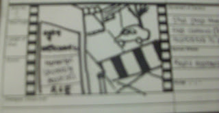
Storyboard
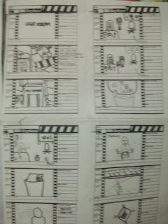
A storyboard serves the same function in film making as an outline does in written projects. It enables the film director to visualise the flow of camera shots and sets that they eventually want to appear on the cinema screen. In our case, we want there to be a clear, drawn picture suggesting the events that will take place in our trailer and tell the story in still image.
We didn't draw on the entire storyboard consisting of 3 pages as our trailer wasn't too long, as well as everyone else's. The story drawn out seemed good enough as we payed attention to shot types and also the storyline that we initially wrote.

There might have been a chance that the storyline might change so we had a feeling that the storyboard may need to be altered later on.
Scripting


The way trailers are now, not a lot contain a lot of dialogue. The visual is more important to the audience, as I found out through my questionnaire. I tried to make the most important lines to give away a bit of the storyline more to tell the audience.
Every use of dialogue used in a trailer is very crucial as it portrays the content, theme and genre of the film[To see clearer click on photos]
Subscribe to:
Posts (Atom)
